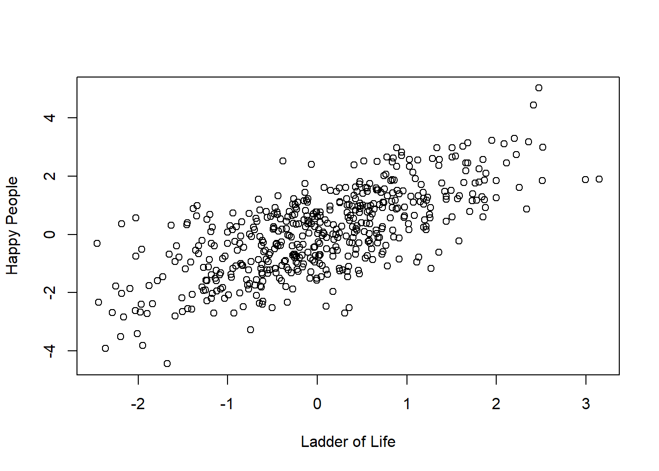
Histogram is the basic representation of the correlation between two normalized quantitative variables. For the above graph those variables being Population vs Life.Expectency.
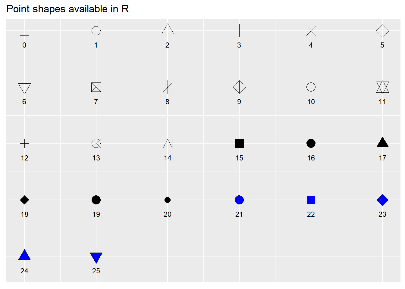
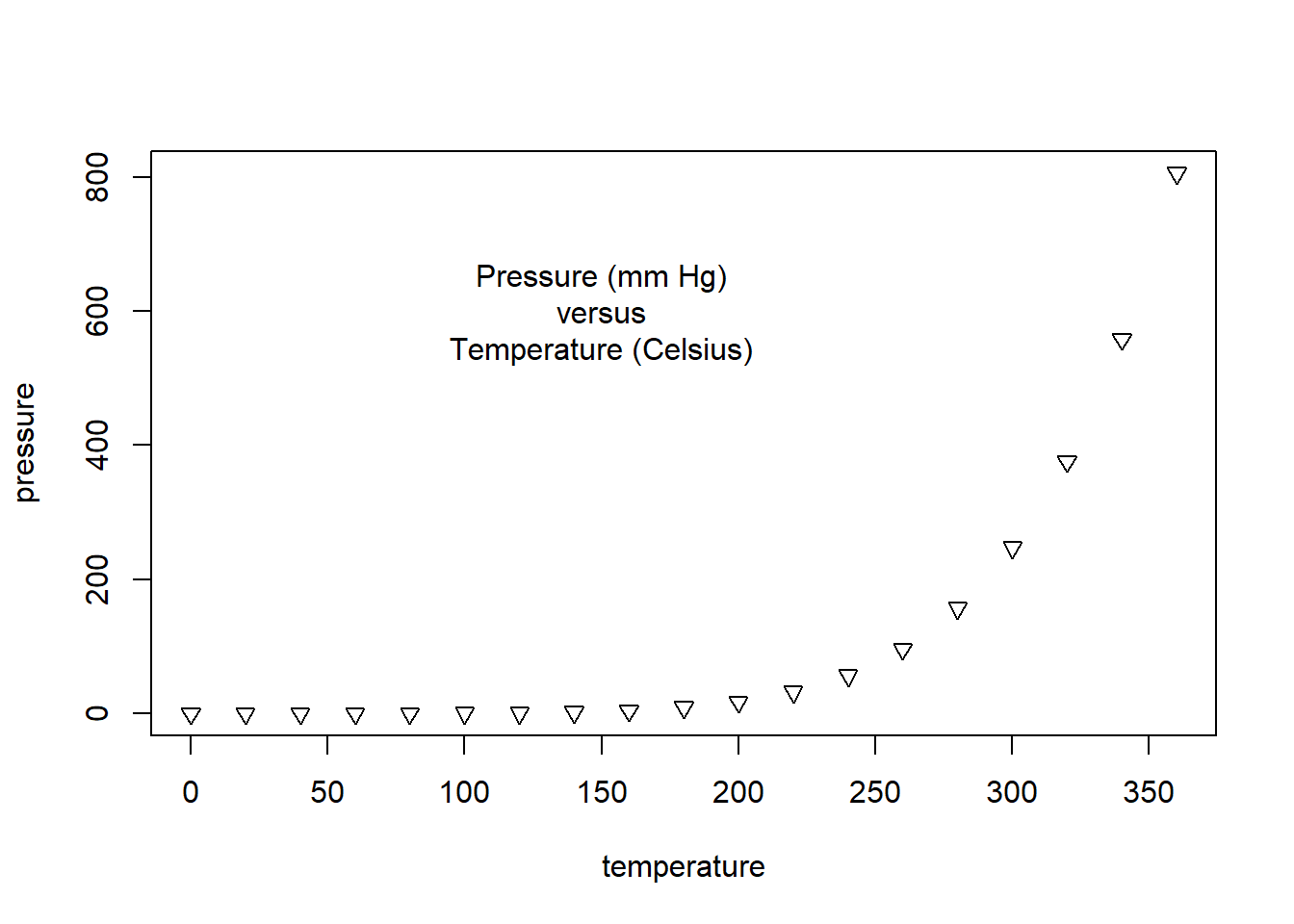
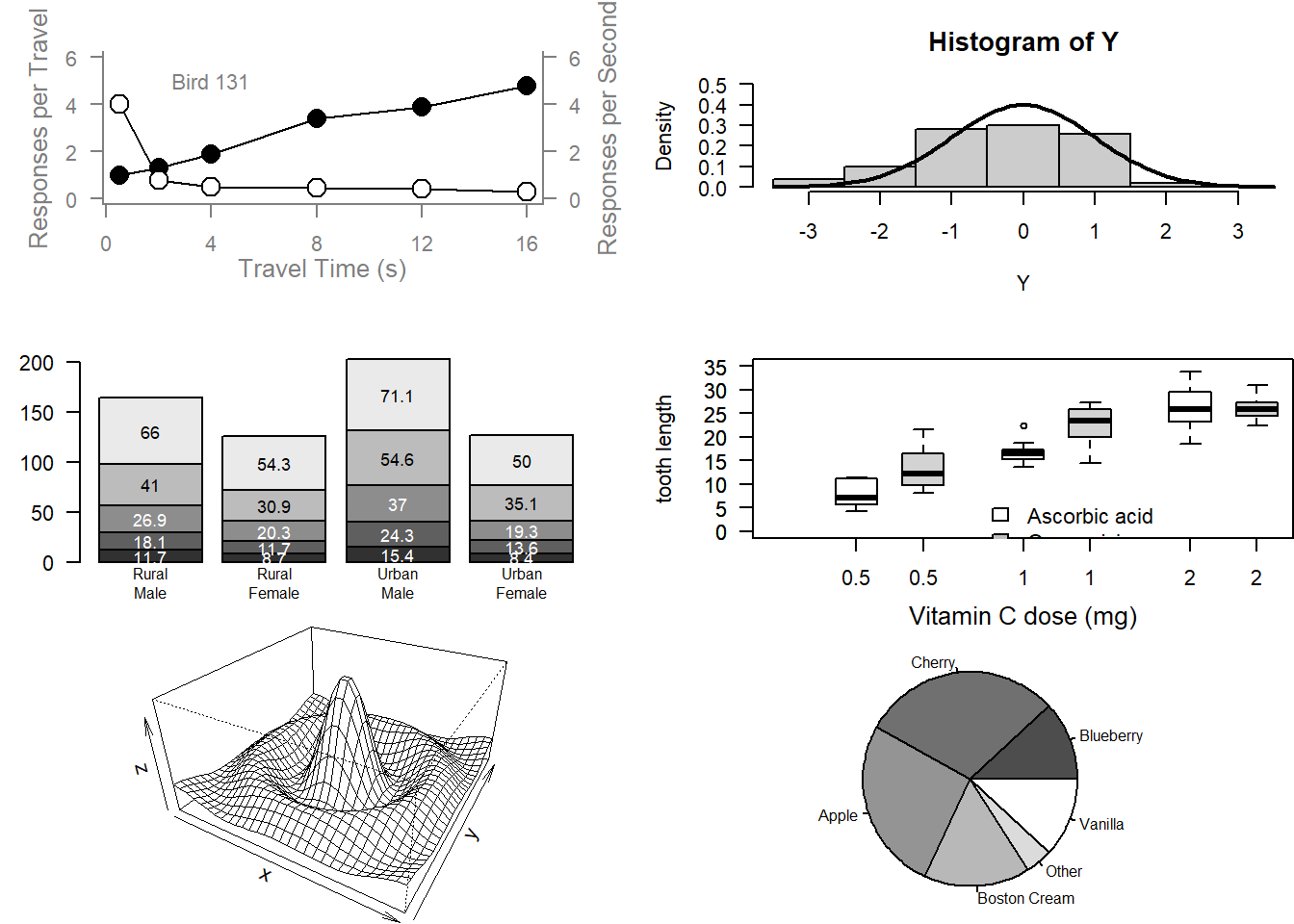
Source Code
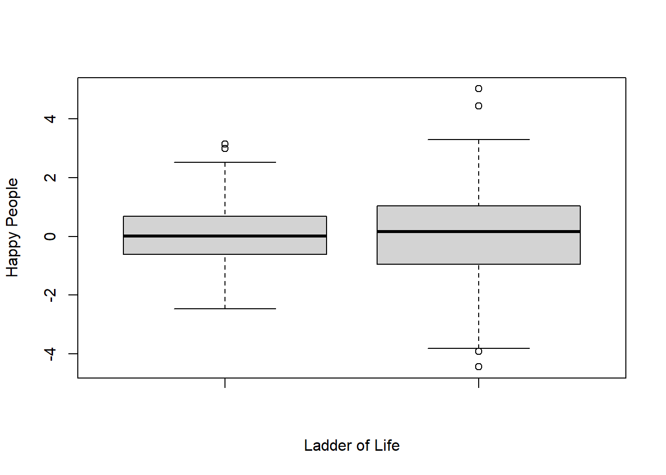
---title: "Assignment 2"author: "Vikrant Sagar R"date: "2022-09-20"categories: [Code, R, Plots, Assignment]draft: falseformat: html: code-fold: true code-tools: trueexecute: echo: false---**1.Build a Quarto blog on your personal website****2.RunPaul Murrell's RGraphics basic R programs**```{r}### Paul Murrell's R examples (selected)## Start plotting from basics # Note the order#install.packages("ggpubr")ggpubr::show_point_shapes()plot(pressure, pch=25 ) # Can you change pch? "YES"#pch is used to determine the point shape for the plottext(150, 600, "Pressure (mm Hg)\nversus\nTemperature (Celsius)")# Examples of standard high-level plots # In each case, extra output is also added using low-level # plotting functions.# # Setting the parameter (3 rows by 2 cols)par(mfrow=c(3, 2))# Scatterplot# Note the incremental additionsx <-c(0.5, 2, 4, 8, 12, 16)y1 <-c(1, 1.3, 1.9, 3.4, 3.9, 4.8)y2 <-c(4, .8, .5, .45, .4, .3)# Setting label orientation, margins c(bottom, left, top, right) & text sizepar(las=1, mar=c(4, 4, 2, 4), cex=.7) #mar is used for defining margins(bottom, left, top, right)plot.new()plot.window(range(x), c(0, 6))lines(x, y1) #plots x,y1 valueslines(x, y2) #plots x,y2 valuespoints(x, y1, pch=16, cex=2) # Try different cex value? It changes the size of the point points(x, y2, pch=21, bg="white", cex=2) # Different background color i.e. whitepar(col="gray50", fg="gray50", col.axis="gray50")axis(1, at=seq(0, 16, 4)) # What is the first number standing for? Defining 'x' axisaxis(2, at=seq(0, 6, 2)) #Defining 'y1' axisaxis(4, at=seq(0, 6, 2)) #Defining 'y2' axisbox(bty="u") #creates a box structure around the plotmtext("Travel Time (s)", side=1, line=2, cex=0.8) #Naming x-axismtext("Responses per Travel", side=2, line=2, las=0, cex=0.8) #Naming y1-axismtext("Responses per Second", side=4, line=2, las=0, cex=0.8) #Naming y2-axistext(4, 5, "Bird 131") #plotting for x=4 & y1=5 and naming as 'Bird 131'par(mar=c(5.1, 4.1, 4.1, 2.1), col="black", fg="black", col.axis="black")# Histogram# Random dataY <-rnorm(50)Y# Make sure no Y exceed [-3.5, 3.5]Y[Y <-3.5| Y >3.5] <-NA# Selection/set rangex <-seq(-3.5, 3.5, .1)dn <-dnorm(x)par(mar=c(4.5, 4.1, 3.1, 0))hist(Y, breaks=seq(-3.5, 3.5), ylim=c(0, 0.5), col="gray80", freq=FALSE)lines(x, dnorm(x), lwd=2) #dnorm is the density functionpar(mar=c(5.1, 4.1, 4.1, 2.1))# Barplotpar(mar=c(2, 3.1, 2, 2.1)) midpts <-barplot(VADeaths, col=gray(0.1+seq(1, 9, 2)/11), names=rep("", 4))mtext(sub(" ", "\n", colnames(VADeaths)),at=midpts, side=1, line=0.5, cex=0.5)text(rep(midpts, each=5), apply(VADeaths, 2, cumsum) - VADeaths/2, VADeaths, col=rep(c("white", "black"), times=3:2), cex=0.8)par(mar=c(5.1, 4.1, 4.1, 2.1)) # Boxplotpar(mar=c(3, 4.1, 2, 0))boxplot(len ~ dose, data = ToothGrowth,boxwex =0.25, at =1:3-0.2,subset= supp =="VC", col="white",xlab="",ylab="tooth length", ylim=c(0,35))mtext("Vitamin C dose (mg)", side=1, line=2.5, cex=0.8)boxplot(len ~ dose, data = ToothGrowth, add =TRUE,boxwex =0.25, at =1:3+0.2,subset= supp =="OJ")legend(1.5, 9, c("Ascorbic acid", "Orange juice"), fill =c("white", "gray"), bty="n")par(mar=c(5.1, 4.1, 4.1, 2.1))# Persp (Perspective Plots) used to view transformation matrixx <-seq(-10, 10, length=30)y <- xf <-function(x,y) { r <-sqrt(x^2+y^2); 10*sin(r)/r }z <-outer(x, y, f)z[is.na(z)] <-1# 0.5 to include z axis labelpar(mar=c(0, 0.5, 0, 0), lwd=0.5)persp(x, y, z, theta =30, phi =30, expand =0.5)par(mar=c(5.1, 4.1, 4.1, 2.1), lwd=1)# Piechartpar(mar=c(0, 2, 1, 2), xpd=FALSE, cex=0.5)pie.sales <-c(0.12, 0.3, 0.26, 0.16, 0.04, 0.12)names(pie.sales) <-c("Blueberry", "Cherry","Apple", "Boston Cream", "Other", "Vanilla")pie(pie.sales, col =gray(seq(0.3,1.0,length=6))) # Exercise: Can you generate these charts individually? 'Yes'#Try these functions using another dataset. Be sure to work on the layout and margins```**2c. Plotting functions**```{r}happy_planet <-read.csv("Happy_Planet.csv")View(happy_planet)x<- happy_planet$Ladder.of.Lifey<- happy_planet$HPIx<-rnorm(500)y<- x+rnorm(500)#scatter plotplot(x,y, xlab ="Ladder of Life" , ylab="Happy People")#boxplotboxplot(x,y, xlab ="Ladder of Life" , ylab="Happy People")```**Histogram is the basic representation of the correlation between two normalized quantitative variables. For the above graph those variables being Population vs Life.Expectency.\**